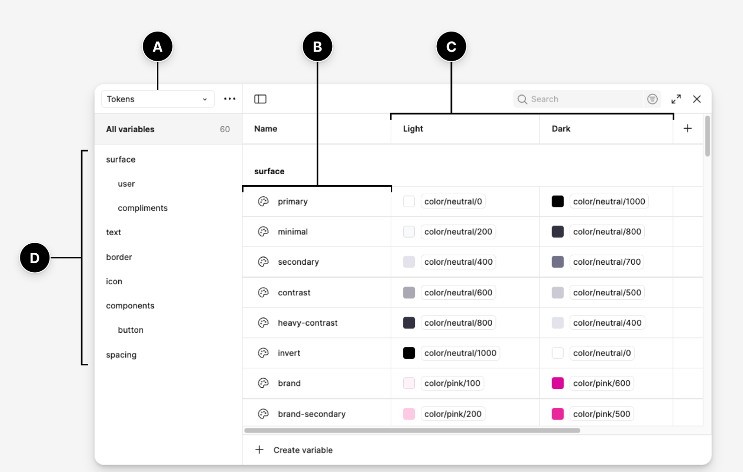
Every Gridform project starts the same way: before a single section is built, we set up Variables for color, type and spacing. It looks like an unnecessary detour to clients who just want to see a homepage — but it’s the step that makes everything after it faster.
The problem with styling page by page
Without a shared set of values, every new section invites a small, separate decision: which blue, which spacing, which heading size. None of those decisions feel costly alone. Across forty sections, they add up to a site that looks consistent only by accident.
That single sentence is the entire argument for design tokens. We’ve adjusted a client’s whole accent color in under a minute, on a live site, in front of them — because the color lived in one place.
What this looks like in Elementor 4
Elementor’s Atomic Editor makes this concrete: define Variables first, build Classes on top of them, then apply States like hover and focus to those Classes. By the time we reach the tenth section of a homepage, we’re reusing, not re-deciding.
It’s a small discipline with a large payoff — and it’s the first thing we teach anyone who joins the studio.
Variables are not a style guide in a drawer
A traditional style guide is useful, but it often lives beside the website instead of inside it. Someone creates a document, everyone agrees on the colors and typography, and then the actual build slowly drifts away from that agreement.
Variables change that. They turn the style guide into something the site actually obeys.
Instead of writing “use this blue” in a separate document, the blue becomes a shared value inside the build system. Instead of asking every designer or developer to remember the correct spacing, the spacing becomes part of the structure. The website stops depending on memory and starts depending on rules.
That is the real value. Not just cleaner setup, but fewer chances for the site to quietly become inconsistent.
The rule we use before building any page
Before we build a homepage, we want to know the basic design language of the site.
What are the core colors?
What type scale are we using?
How much spacing should sections breathe with?
What does a primary button look like?
What happens when someone hovers, focuses, or interacts?
Which styles are global, and which are rare exceptions?
We do not need every answer to be perfect on day one. But we do need a starting system.
Because once the first few sections are built without rules, the project already begins collecting debt. Not technical debt in the traditional sense, but design debt: repeated values, inconsistent decisions, and visual choices that become harder to clean up later. A good Elementor build does not start with a hero section. It starts with the system the hero section will belong to.